

Useful Tools for Graphic Design
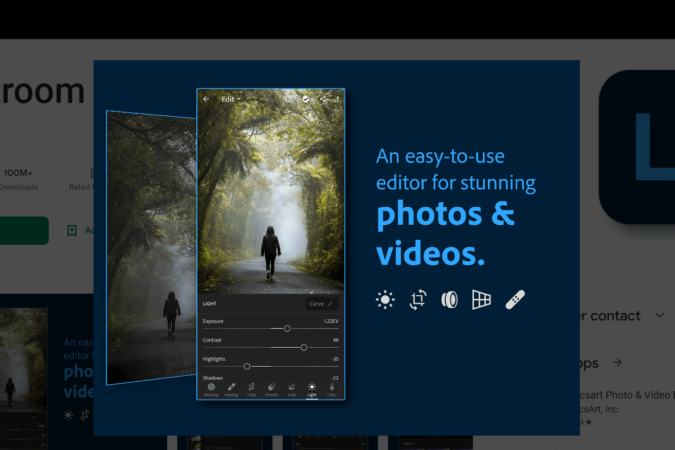
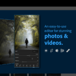
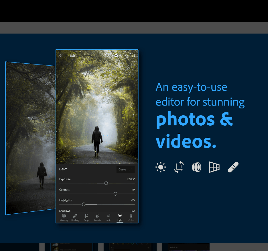
10 Free Photo Editing Apps for iOS and Android
All photographers know that post-processing is an essential part of the photography process. Whether you're a pro who spends hours in Photoshop or Lightroom, or someone who just likes to...
Best Photo Scanning App for iOS and Android Devices
Taking photos is the best way to preserve treasured memories but what about those photos taken before the birth of the digital world where only hard copies of photos were...
Educational Infographic Posters You Can Get Online
Infographics have become an essential learning tool, providing visual impact that affects students’ understanding. An excellent poster has great visual elements that learners will respond to. Since our eyes are...

20 Best Free Photo Organizing Software for Windows & Mac
Taking photos is the best way to preserve treasured moments and precious memories. We take photos using our cameras or our phones and we save these photos in our computers....
Check Out Our Latest Posts
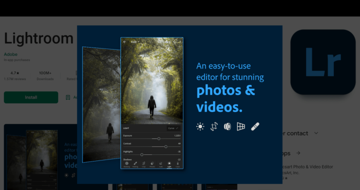
10 Free Photo Editing Apps for iOS and Android
All photographers know that post-processing is an essential part of the photography process. Whether you're a pro who spends hours...
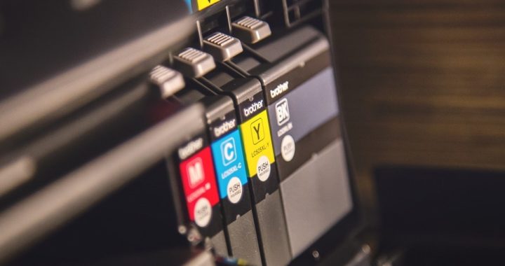
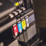
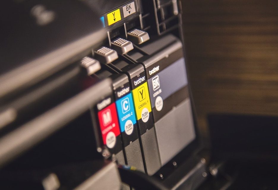
8 Best Chromebook Compatible Printers in 2023 + Detailed Printing Guide
Getting printers to work with Chromebook is a painful process sometimes. And the worst thing is that your printer may...
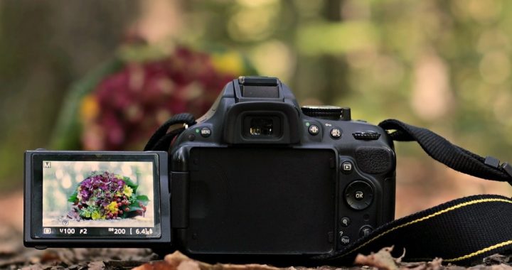
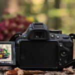
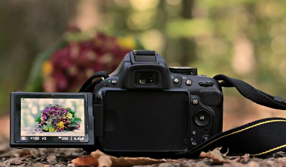
The 10 Best Vlogging Cameras with Flip Screen You Can Get in 2023
If you happen to be looking for the best vlogging camera with flip screen, then you are in the right...
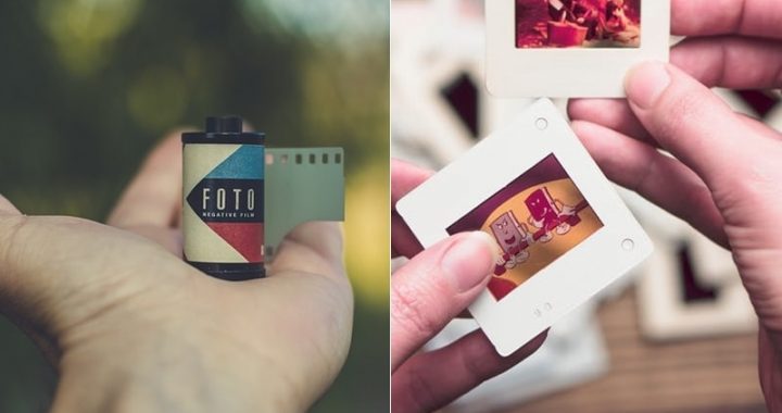
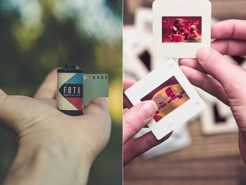
Best Film and Slide Scanners in 2023: Convert Negatives to Digital Easily
Because of the rapid advancement in technology and the birth of the digital age, darkrooms are not so common these...
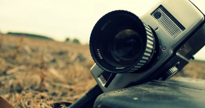
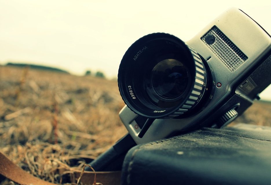
Best Super 8 Film and 8mm Film Scanners in 2023
Years ago, people used to record their memories on film. However, if not properly kept, the film has a tendency...